Mobile SEO: How to Optimise for Mobile Search

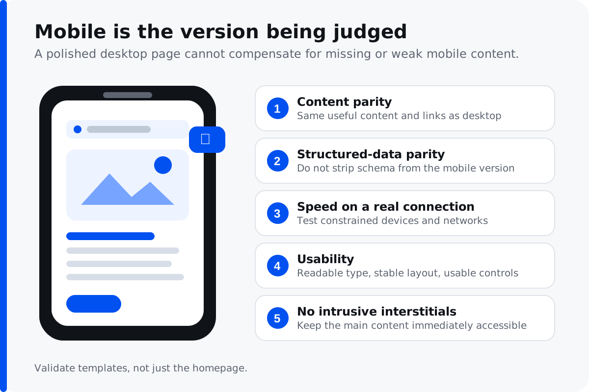
Mobile SEO is the practice of optimising your site so the mobile version is fast, usable and complete — because Google predominantly uses the mobile version of a page for indexing and ranking. If content, links or structured data exist on desktop but not on mobile, they effectively do not exist for search purposes. With most web traffic now coming from mobile devices, mobile SEO is no longer optional.
What is mobile SEO?
Mobile SEO is search engine optimization focused on how your site performs for people searching on smartphones and tablets. It covers three things: making sure the mobile version of your content matches desktop, making mobile pages load quickly on real connections, and making the mobile user experience easy to use on a small screen. Do those well and your mobile rankings improve; neglect any one of them and you leak traffic you have already earned.
It is worth separating mobile SEO from desktop SEO in your head, even though most best practices overlap. The ranking signals are the same, but the constraints are harsher on mobile — smaller screens, slower connections, one-handed use, and searchers who are more often in a hurry. Optimizing for mobile means designing for the worst case, not the best.
Why mobile SEO is important
The majority of searches now happen on mobile devices, and for many local and consumer categories mobile traffic dwarfs desktop. That alone would make mobile optimization matter. But the bigger reason is structural: Google indexes the mobile version of your site, so the mobile experience is the one being judged for every ranking — including searches made on a desktop computer.
There is also a conversion argument that is easy to check in your own analytics. If mobile traffic is high but mobile conversion is markedly lower than desktop, the problem is usually experience rather than traffic quality. That gap between mobile visitors arriving and mobile visitors converting is one of the more reliable signs that mobile SEO work will pay for itself.
How mobile-first indexing affects SEO
Google crawls and indexes using a smartphone user agent, and what it finds on the mobile version is what gets ranked. This mobile-first index has been the default for years, but the implications still catch sites out — particularly ones where the mobile experience was treated as a reduced version of the real thing.
The practical consequence is simple and unforgiving: any content hidden, shortened or removed on mobile is content search engines may not credit you for. If your mobile template drops sections, truncates text or removes internal links to save space, you are removing them from what gets indexed. Responsive web design largely avoids this because the content is identical across mobile and desktop and only the layout changes — separate mobile templates are where the problem usually appears.
Common mobile SEO mistakes
Content that differs between mobile and desktop
Content parity is the single most important mobile SEO principle. If the mobile version of your site shows less than desktop, you rank on the smaller version. Check that headings, body copy, internal links and images all survive the jump to mobile screens.
Structured data missing on mobile
Schema markup implemented only on the desktop template is a surprisingly common oversight. If your structured data is not on the mobile version, it is not being read, and you lose the rich results it would otherwise earn.
Intrusive interstitials and popups
Popups that cover content immediately on arrival can suppress mobile rankings, and they annoy people regardless. Cookie notices and age verification are treated as acceptable; a full-screen newsletter signup before anyone has read a sentence is not.
Blocked resources
If CSS, JavaScript or images are blocked from the crawler, Google cannot render the mobile page the way a user sees it, and mobile usability signals suffer. Make sure the mobile version of your site is fully crawlable.
Mobile page speed and Core Web Vitals
The most common testing mistake is checking mobile performance on office broadband on a fast laptop. Test on a throttled mobile connection instead, because that is closer to how your visitors experience it — on mobile data, in a queue, with a signal that comes and goes. Mobile page speed is where most sites lose the most ground.
Google measures the mobile experience through Core Web Vitals: Largest Contentful Paint (how quickly the main content appears), Cumulative Layout Shift (how much the layout jumps as it loads), and Interaction to Next Paint (how quickly the page responds to a tap). All three are ranking signals, and all three are usually worse on mobile than desktop.
The usual causes of slow mobile pages are large unoptimised images, render-blocking JavaScript, too many third-party scripts, and web fonts loading before anything becomes visible. Images are almost always the biggest single win, and modern formats plus correct sizing typically cost nothing in quality. Layout stability matters too: content that jumps as adverts and images load causes mis-taps and frustration, and reserving space for elements before they load solves most of it. Accelerated Mobile Pages (AMP) was once Google's answer to mobile speed, but it is now largely deprecated — a fast, well-built responsive page achieves the same result without the maintenance overhead.
Responsive design and the viewport
Responsive web design is the recommended approach for mobile optimization because it serves one set of content that adapts to any screen size. The alternative — a separate mobile site on its own URLs — creates duplicate content management overhead, redirect complexity and the constant risk of the two versions drifting apart. You almost certainly do not need a separate mobile site.
A correct viewport meta tag is the foundation: it tells the browser to match the page width to the device screen rather than rendering a shrunken desktop layout. Combined with flexible images and readable base font sizes, it is what makes a page genuinely mobile-friendly rather than merely visible on a phone.
Mobile usability details that matter
Tap targets need to be large enough to hit accurately — buttons and links crammed together produce accidental taps and abandonment. Text should be readable without pinch-zooming on small mobile screens. Forms should use the correct input types so mobile keyboards adapt, which sounds trivial and measurably improves completion rates.
For local businesses this matters even more, because mobile searches frequently carry urgent intent. A phone number that is not tappable, or a page that takes six seconds to load when someone needs a plumber now, costs you the job directly. Our local SEO guide covers where mobile usability and local rankings intersect.
How to check if your site is mobile-friendly
Do not assume the template works — test the rendered mobile version of your key pages. A few reliable ways to check:
- Lighthouse (built into Chrome) scores mobile performance, accessibility and best practices, and flags specific fixes.
- PageSpeed Insights reports real-world Core Web Vitals for the mobile version alongside lab data.
- Google Search Console shows mobile usability issues across your whole site and lets you inspect how Googlebot renders any URL on mobile.
- An actual phone. Walk through your own conversion path as a customer would, on mobile data rather than office wifi. That last step surfaces problems no tool reports: a form that is awkward one-handed, a menu that is hard to close, a critical button below three screens of scrolling.
Where mobile and desktop results diverge
Rankings are not identical across devices, and the differences are informative. Local results appear far more prominently in mobile SERPs, because mobile searches carry location intent more often. Results also tend to favour pages that load quickly on constrained connections, so a heavy page can rank respectably on desktop and poorly on mobile for the same term.
Search behaviour differs too. Mobile queries are shorter, more likely to be voice-initiated, and more likely to be urgent — "open now", "near me", "how to fix" while standing in front of the problem. If your content only addresses considered, research-stage questions, you may be invisible for the moment your customer most needs you.
Mobile SEO and AI search
Worth noting because it is becoming relevant: AI answer engines retrieve pages before generating answers, and slow or JavaScript-dependent pages are less likely to be retrieved successfully. The same mobile optimization work that helps mobile rankings improves your odds of being cited in AI answers, which we cover under AI SEO.
Mobile SEO best practices checklist
If you want a short list of mobile SEO best practices to work through in order:
- Serve identical content on mobile and desktop — full content parity.
- Use responsive design with a correct viewport rather than a separate mobile site.
- Compress and correctly size every image; they are the biggest mobile page speed win.
- Pass Core Web Vitals on the mobile version, tested on a throttled connection.
- Make tap targets large, text readable, and forms mobile-friendly.
- Keep structured data on the mobile template, not just desktop.
- Remove intrusive interstitials that cover content on arrival.
- Confirm nothing critical is blocked from the crawler.
Where to start
Compare your mobile and desktop content for anything missing. Test your three highest-value pages on a throttled connection. Then complete a purchase or enquiry on your own phone and note everywhere it felt awkward. If the problems turn out to be structural rather than superficial, technical SEO covers the diagnostic and remediation work, and our web design team handles cases where the underlying build is the constraint.
Google's documentation on mobile-first indexing is the authoritative reference.